DIDO AGENCY BRAND GUIDELINES
These are some of the components of our brand and how to apply them when referencing DIDO Agency.
The Logo
The Logo
Our Logo is unique by nature. The Icon is part of a Wordmark.
It can be seen as a stickman when rotated counterclockwise, however, DIDO Agency does not use this as part of our imagery. DIDO Agency prioritizes 3D illustrations and mockups, which is discussed later in the brand book.
While creating graphics, you are expected to embed the Magnet icon as it represents DIDO’s mission.
The Logo guidelines must be adhered to in all DIDO Agency work.
Exclusion Zone
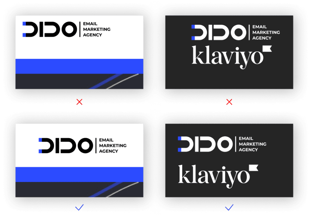
The Exclusion Zone helps to protect visual elements from being too close to the Logo. When executed wrong it can lead to confusion in the brand hierarchy.
This zone equals to Icon D (no dots).
Examples
These images illustrate the dos and don’ts of using the Exclusion Zone.
As you can see, the top examples do not properly follow the Exclusion Zone while the bottom examples are clear and solid.

Examples
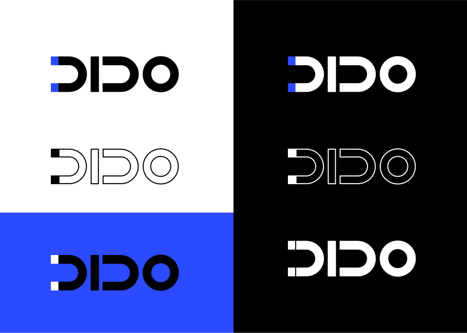
The primary version of DIDO’s Logo is duocolor, using #000000 and #2C4AFF.
There are several versions that can be used for different purposes, using both a solid or outlines Logo. However, you must not lose the Magnet icon.
The full Logo version has two options: vertical and horizontal.
There is also a Ukrainian flag version of the Logo since DIDO’s Founder is Ukrainian, as well as a majority of the team.

Logo Misuse
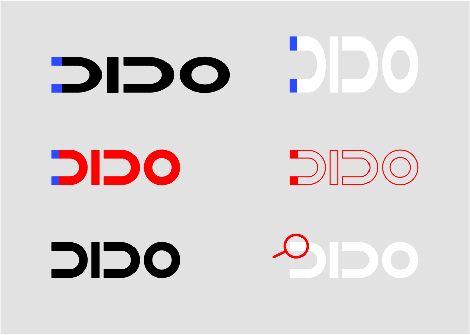
Be careful to not dilute brand identity. Never alter the Logo in any way outside of the Brand guidelines.
The Logo should never be changed in scale, skewed, or rotated, and color variations outside of the Brand guidelines must be avoided. Additionally, the Logo should never be horizontally or vertically distorted, and a drop shadow should never be applied.
Examples of Logo Misuse are illustrated on this page.

Examples
Logo Placement
Regardless of destination the Logo can be placed in 6 locations:
Corners – long or short horizontal
Top middle – short Icon
Center – centered
The Logo must be aligned with the text or visual elements by a grid.

The Color
DIDO Ultra Blue
Blue calls to mind feelings of calmness or security. It is often described as peaceful, tranquil, secure, and orderly. Blue is often seen as a sign of stability and reliability.
Ultra Blue is also a tech color associated with high tech.
DIDO Ultra Blue
Ultra Blue is a very vivid color. It should not be used on more than 15% of the frame otherwise the final product can be overwhelming.
Avoid any color combinations that can lead to color vibrations.
Avoid color combinations with Ultra Blue that can lead to color vibrations. Use solid black, white, and whiter shades of grey. You can also use off-white and off-black.
Other colors like complimentary yellow can be added as illustration colors, but the design must always look cohesive.

The Font
The Font
DIDO’s main font is Montserrat, a moderately-rounded Sans Serif font.
Sans Serif fonts are the most traditional option, eliciting feelings of heritage and tradition while making your brand feel established.
Montserrat is associated with straightforwardness, trust, modernity, and minimalism.

The Illustrations
The Illustrations
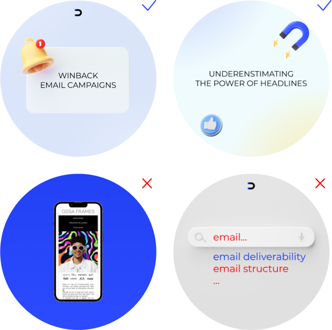
2022-23 trends show an overwhelming reliance on 3D illustrations.
DIDO has made sure to prioritize the use of 3D illustrations with the exception of duo linear icons. These icons are only used as supportive imagery in already crowded designs and do not need to be 3D.

DIDO brand