
Why Email Design Matters
It’s wise to approach design as an intentional act, an act that shows we are interested in our user’s experience and want to create something that elicits a response from our audience. There are 4 specific reasons why strong email design matters in email marketing.
1. It helps you stand out in the inbox.
It’s estimated that the average office worker receives over 120 emails per day! A well-designed email is going to help you break through the noise of the inbox and engage your subscribers. Make your content enjoyable, your design intriguing and attractive, and take your audience on such a good journey that they can’t wait to get your next email.
2. It acts as an extension of your brand.
Your email marketing program is a direct extension of your brand, and should always reflect your brand voice and feel. Be sure to use every opportunity to echo your brand’s sentiments, from an exciting subject line to a pointed CTA. Always look for opportunities to add your brand’s personality into your copy, whether it’s by using a conversational style of writing or including brand-specific words and phrases.
Consistent and on-brand email design (i.e. being consistent with color, logos, and layout), reduces the chance of confusing your subscribers. If it’s clear that the email is from your company, it’s easier for the subscriber to absorb your message in context.
3. It increases your deliverability.
Did you know that it’s possible for email design can actually trigger automatic spam filters? But, more likely, a poorly designed email will lead to your subscribers taking action such as unsubscribing or marking it as spam. Having your emails marked as spam can impact your sender’s reputation which you definitely don’t want. Analytics and insights allow you to keep an eye on how subscribers respond to your messages, so use this data to guide your artistic process and make strong design choices
4. It increases accessibility through inclusive design.
As a marketer, you want to reach a large and engaged audience. Because of this, email design that doesn’t take into account accessibility guidelines (like color contrast, inclusive language, and coding habits) can actually ostracize your audience. Without adhering to accessibility guidelines, your message won’t resonate with your audience… or it might not even reach them.
While accessibility focuses on the structures and containers that hold information, Inclusive Design is based on the information itself, and on your understanding and empathy with your audience. Consider your subscribers’ experiences and abilities, then create emails that reflect that. The connections that you draw between what you’ve made and who interacts with it will pay off tenfold.
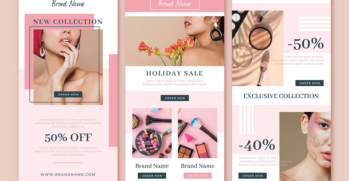
Brand Consistency
When people first get an email, one of their first reactions is to wonder “Who is this from?” If this question is left ambiguous, they will unsubscribe, or worse mark it as spam.
The ‘From Mailing Address’ and Subject Lines do a lot of the heavy lifting for brand consistency, but the visuals can have a lot more staying power. Brand recognition allows your subscriber to spend more time with your content, and brand consistency increases your resonance with them. It enables the user to picture something specific as opposed to something generic.
For example, picture coffee. Now picture Starbucks. You’re likely seeing that specific shade of green, those stark white cups, and the dual-tailed mythical siren, right? While your industry may be vast, you want to find what elements of your brand make you stick out and be unique.
That’s why it’s important to make your emails easily recognizable and build a seamless experience between your email marketing program and your other channels. Consistently using your logo and applying a color story (AKA following your brand guidelines) are some of the most effective ways to accomplish this. If you don’t have brand guidelines to follow, you should work on creating those immediately.
Another great way to maintain brand consistency is to use the same design elements in your email marketing program as you do on your website. Think of your email template as a sibling to your website; they don’t have to be identical, just similar and recognizable.
Brand consistency doesn’t require a complicated design system; it just requires recognizable experiences across all media and marketing channels.
Content Hierarchy
Whether you realize it or not, you’ve probably done content hierarchy work during your content creation process. Maybe you’ve established the most important pieces of content and created an inverted pyramid ranking your content from most important to least. This is precisely establishing a content hierarchy! Even starting with a headline or hero image that then feeds into a paragraph or body copy is a form of basic (but helpful) content hierarchy, which translates well to email.
Content differences create visual interest and help to guide your subscribers through a campaign and keep them engaged. Hierarchy can manifest in two different ways:
1. Typographically
The use of different weights, styles, and colors within font choices establishes the way in which people read and rank importance. A 4px difference between each one of your styles is a good rule of thumb when creating a typographic hierarchy. Also, be sure to assign these styles in your HTML to assist with screen readers.
2. Pictographically
Pictographic hierarchy refers to imagery, primarily photos, illustrations, and icons used within your email.
Photography should always be at the top of the hierarchy. It’s the most effective way to engage your audience because people tend to look to other humans for a sense of connection. Illustrations should be secondary to photography, although they are still effective; bright illustrations can be used to simplify feelings and emotions creatively.
Iconography can be used as a quick solution by using elemental shapes for simple understanding, but this might be lost in translation so use it sparingly.
Balancing color with size and layout can help build a clear hierarchy that is immediately recognizable. This creates visual interest and helps with skimming, which we know is a common practice in email. Easily read copy turns into engagement, which leads to interactions like clicks, forwards, and shares.
While every brand adheres to slightly different standards, designers should combine the qualities of each pictographic element to tell compelling stories.
Sections and Modules
The requirements for good emails are ever-changing, and we need to be able to adapt quickly. Segmenting email design into sections or modules is imperative to agile design. These sections help set expectations for copy and design by having established parameters, allowing you to place content appropriately.
Sections and modules make testing super easy, too. You can move these sections around throughout your campaign and see which ones in what quantity work best for your audience.
Naturally set hierarchies allow you to give the biggest real estate to your most important topics – and as importance or content availability shrinks so does space. There’s an old saying that goes ”when you emphasize everything, you emphasize nothing,” and that definitely applies to design.
Wrap Up
Design is the foundation of your emails. It has a huge influence on your brand and the overall impact of your campaigns. There’s a lot to consider when approaching email design, from accessibility and inclusion to hierarchy and deliverability, so ensure you’re planning your email design with care and intention.